Project Type: Passion Project
Team: Solo Project
Skill: UI/UX Design, UX Research
Duration: 12 Weeks
Background
This project showcases my design of an AR experience for a fictional exhibition set within a museum context. I conducted primary and secondary research to learn more about museum visitors and to understand their motivations and thought processes. What is their typical approach to visiting a museum? What matters most to them while exploring? Why do they choose to go to museums? What is their learning experience like within the museum?
User Interview
Conduct semi-structured interviews with 4 participants online.
Participants are between 18 and 25 years old.
Record all interviews in audio format.
Interactivity
"The experience that I remember the most provides an interactive way to help me understand the background behind the artwork."
Exploration
"I mostly take glances, only pause when something catches my interest."
Accessibility
"I don't have an unlimited data plan, so I have difficulties using a QR code-based audio guide."
Secondary Research
According to “An Identity‐Centered Approach to Understanding Museum Learning” by John H. Falk, there are five identities based on visitors’ motivations. All my interviewees’ motivations are highly similar to “The Experience Seeker“ and “The Explorer.“
"I went to the museum because I brought my friend from other cities to a famous tourist spot in my hometown."
Experience Seeker
These individuals, often tourists, were motivated to visit primarily in order to “collect” an experience, so that they could say they’ve “been there, done that.”
"I usually go to museums because I am interested in their exhibitions, especially those that focus on art."
Explorer
These individuals said they visited because of curiosity and/or a general interest in discovering more about the subject or the content of the institution.
Key Findings
Interviewees went to the museum to seek a new experience or satisfy their curiosity about the exhibition.
Interviewees expressed a lasting impression of interactive elements within the exhibitions, which enhanced overall experience.
One interviewee pointed out difficulties with QR code-based audio guides due to limited data plans and weak public Wi-Fi.
How might we create an interaction to keep users engaged?
Transform the paper-based guide and audio guide into a digital version to increase interactivity.
How might we add a feature that can be used without the Internet?
Users with limited online access can buy tickets online and download their tour guide.
Interactive Guide
Scan an Exhibit
Display 3D Model and Audio Guide
Play Audio Guide
Interact with 3D Model
Tap for Closed Caption
TICKET
Ticket Page
Select an Exhibition
Ticket information
Payment
OFFLINE
Tour Page
Select an Exhibition
Select a language
Download Guide
Low-Fidelity Prototype
01
Feedback
Participants find the user flow of the AR camera unclear.
Improvement
Add a 3D object after the user taps the screen.
02
Feedback
Participants struggle to realize they should drag twice to open closed captions. They find this action not very intuitive.
Improvement
Allow users to tap once to access Closed Captions.
03
Feedback
Participants express confusion in locating their tours within the application. Some are unable to find previously downloaded AR tours.
Improvement
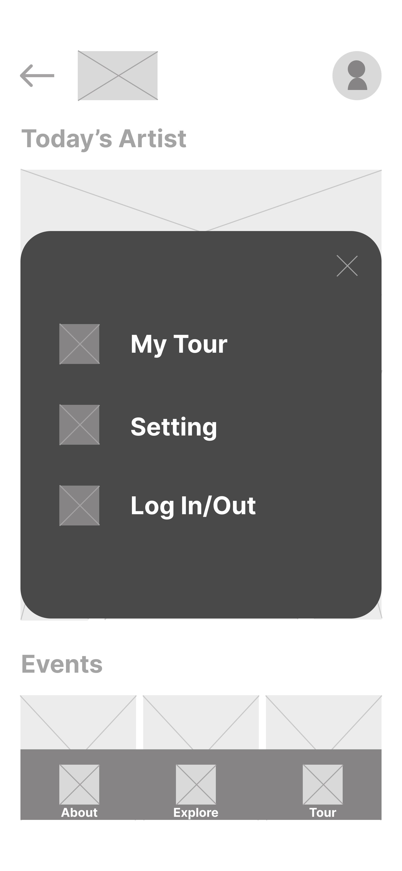
Enhance the navigation and organization of the tours section. Remove "My Tour" from the avatar and change it to the tour page.
High-Fidelity Prototype
01
Feedback
Participants suggest additional interactive elements.
Improvement
Users are able to tap on objects to identify key points of the exhibits.
02
Feedback
Participants have problems with finding the Proceed button during the payment.
Improvement
Emphasize the button.
Final Design
01
Utilize Augmented reality to digitalize the guidebook and audio guide to increase interactivity and engagement.
02
Purchase tickets in advance to schedule your visit.
03
Add the download feature to increase visitor accessibility.
Style Guide
Reflection
What I learned from this project?
Complicated interactions such as dragging twice could lead to user confusion.
When designing user flows, I should consider more scenarios, such as “Do users search for an exhibition?”
What I didn't consider?
Is there enough space in the museum that users can move around?
Do people want to download an application for a guide?
What kind of exhibit is suitable for this kind of technology?
What's next?
Deepen my understanding of AR and explore diverse interactive elements like gestures to test different effects on engagement.


